Logo Redesign: When to Do It, How to Do It, and How Not to Lose Your Brand Equity
There are few decisions in a company’s life that generate as much internal debate as a logo redesign. Gap’s 2010 logo change lasted six days before being reversed. Tropicana’s 2009 packaging redesign cost the brand $30 million in lost sales before being pulled. Mastercard, on the other hand, refreshed its logo in 2016 to remove the wordmark from the circles and the result is now considered a model of confident, successful brand evolution.
The difference between a logo redesign that strengthens a brand and one that destroys customer goodwill often comes down to three things: whether the redesign was strategic or reactive, whether it respected and built on existing equity, and whether the rollout was executed with care. This guide walks through all three.
“Redesigning a logo is not starting over. It’s editing a sentence that’s already half-written in the minds of your customers.” — Marty Neumeier
The Five Signals That Tell You It’s Time to Redesign
Not every aesthetic discomfort with your current logo is a signal to redesign. Redesigns have real costs: financial investment, internal disruption, temporary brand recognition dip, and asset replacement across every touchpoint. Before starting a redesign process, validate that at least one of these five conditions is true.
Signal 1: Your Business Has Materially Changed
You’ve pivoted from B2C to B2B. You’ve expanded from one country to ten. You’ve moved from a horizontal product to a vertical. You’ve repositioned from budget to premium. When the business fundamentally changes, the brand should reflect that change—including the visual identity. A logo designed for a consumer food company doesn’t serve a B2B enterprise software company trying to close seven-figure contracts.
Signal 2: Your Target Customer Has Changed
The visual signals that attract one customer segment can actively repel another. If your growth strategy requires reaching a new audience, your logo needs to speak to them. A brand redesign is sometimes the clearest signal to a new market that you’re serious about serving them.
Signal 3: The Logo Doesn’t Work Across Modern Contexts
Many logos designed before 2010 were built for print-primary contexts: business cards, brochures, and letterheads. They don’t have a clean favicon version. They fall apart in app icons. They have fine detail that disappears at small sizes. They don’t have a dark-mode variant. If your logo actively fails in digital contexts, that’s a functional problem, not an aesthetic one.
Signal 4: The Logo Signals the Wrong Category
Visual identity patterns cluster by industry—each category has its visual conventions. If your logo accidentally reads as belonging to a different category than you operate in, it’s working against your positioning. A healthcare company whose logo looks like a gaming brand, or a premium consultancy whose logo looks like a discount retailer, faces an uphill credibility battle that a redesign can resolve.
Signal 5: You Blend Into Your Competitors
Competitive differentiation is a legitimate business reason for a redesign. If your logo could be swapped with a competitor’s and nobody would notice, you have a distinctiveness problem. The purpose of a logo is to be recognized as you. If it doesn’t accomplish that, it’s not doing its job.
What Not to Do: The Most Common Logo Redesign Mistakes
Redesigning Because You’re Bored
Logo fatigue affects founders more than customers. You see your logo thousands of times a year. Your customers see it a fraction of that. What feels dated or stale to you may still be building recognition with your audience. Internal aesthetic fatigue is one of the worst reasons to redesign because it optimizes for the founder’s taste rather than the brand’s equity.
Abandoning Everything in Service of “Starting Fresh”
Brand equity lives in the elements customers have come to recognize. For established brands, a logo redesign should be an evolution, not a blank-slate restart. The right question isn’t “what would we design if we had no existing brand?” It’s “what aspects of the existing brand carry equity worth preserving, and how do we modernize everything else?”
Even significant brand evolutions typically preserve some continuity: Starbucks moved from a fully illustrated mermaid with text to a clean icon-only version, but the mermaid form, the green color, and the circular composition all remained. That continuity preserved the recognition while enabling the evolution.
Designing in a Vacuum
Redesigns fail when they’re designed without understanding current customer associations with the brand. Before a redesign, survey customers and stakeholders about what the current brand means to them. What do they associate it with? What do they value? What do they wish it communicated? The redesign should build on the positive associations and correct the gaps—not discard everything and start from zero.
Announcing Before Implementing
Nothing erodes confidence in a rebrand faster than announcing a new brand while the old one is still live everywhere. The rebrand announcement should be synchronized with implementation: website, social profiles, materials, email signatures, and every public touchpoint updated on or before launch day.
The Logo Redesign Process
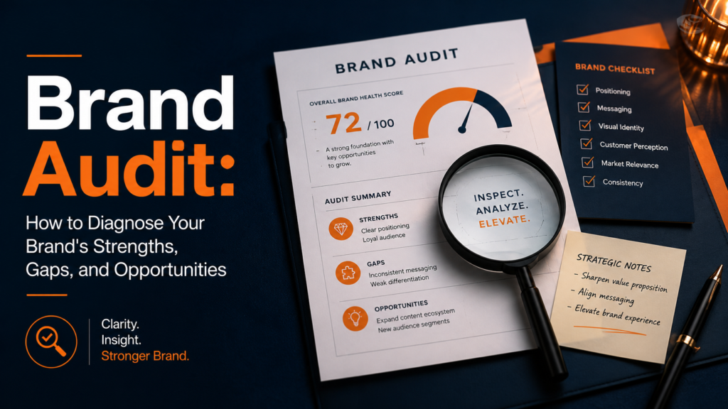
Phase 1: Brand Audit and Equity Assessment
Before any design work, understand what you’re working with. An equity assessment answers three questions: What elements of the current logo are recognized and positively associated? What elements are neutral (carry no particular positive or negative association)? What elements are actively working against the brand?
Elements with strong positive equity are candidates for preservation or modernization. Elements that are neutral can be redesigned freely. Elements that actively harm the brand should be eliminated.
Phase 2: Competitive and Category Analysis
Map the current visual landscape of your category. Where are the visual conventions? Where is the white space for differentiation? What signals does your category expect, and which ones are negotiable? This analysis ensures the redesign differentiates you from current competitors, not from the competitive set that existed when the original logo was designed.
Phase 3: Design Brief and Direction Setting
A redesign brief is distinct from an original design brief. It needs to explicitly address: what aspects of the current identity are being preserved, what’s being evolved, what’s being replaced, and why each decision is being made. The brief also needs to articulate the strategic destination—what should the redesigned logo communicate that the current one doesn’t?
Phase 4: Concept Development
The design process for a redesign typically explores a spectrum of change: from minimal refinement (modernizing the current logo without changing its essential character) to substantial evolution (preserving core elements while rebuilding the design from the ground up) to full replacement (starting fresh, usually for brands with minimal existing equity to preserve).
Presenting concepts across this spectrum lets clients make an informed decision about how much change is appropriate, rather than being presented with a single direction that presupposes the right amount of evolution.
Phase 5: Rollout Planning
A logo redesign without a rollout plan is a brand disaster waiting to happen. The rollout plan specifies every asset that needs to be updated, who is responsible for each, and what the launch sequence is. For established brands, this can be a significant logistical undertaking: hundreds of brand applications across digital and physical contexts all need to be updated.
The general principle: digital assets first (website, social, email), then print assets (business cards, letterheads), then environmental (signage, packaging). This sequence minimizes the period where old and new brand exist simultaneously in public-facing contexts.
Logo Redesign vs. Brand Refresh vs. Full Rebrand
These terms are often used interchangeably but describe meaningfully different scopes of work:
Most established startups and small businesses need a brand refresh rather than a full rebrand. Full rebrands are appropriate when the strategic direction, target market, or business model has fundamentally changed—not just when the logo looks dated.
Protecting Brand Equity During a Redesign
Identify Your Brand’s Equity Vectors
Brand equity lives in specific visual elements that customers have associated with you. For Coca-Cola, it’s the red color and the script typeface. For FedEx, it’s the purple and orange color combination. Identify your brand’s equity vectors before you change them—these are the elements that require continuity, even if everything else changes.
Use the “Squint Test”
Squint at your current logo until it blurs. Which elements remain recognizable? The surviving shapes and color impressions are your brand’s most deeply encoded elements. These are the hardest for customers to learn a new version of, and therefore the elements that benefit most from continuity in a redesign.
Test With Customers Before Launching
Show a small group of current customers the new design before launch. Not “do you like it?” (a question that produces taste-based responses) but “what does this communicate to you?” and “how does it compare to what you associate with us now?” The gap between intended communication and actual reception is where brand redesigns go wrong.
For the broader brand strategy context that should inform a redesign, see the branding strategy guide for startups. For understanding the full scope of what a brand design system includes beyond the logo, see the brand design overview.
Executing the Logo Redesign
A logo redesign project is ultimately a branding exercise, not just a design exercise. The best outcomes come when the designer and client agree on the strategic direction before aesthetics enter the conversation. Get the strategy right first; the design follows from the strategy.
Key questions to resolve before any design begins:
- What is this redesign trying to accomplish, in one sentence?
- Who is the primary audience for this change?
- What do we need them to feel or believe that they don’t currently feel or believe?
- What elements of our current identity carry equity worth preserving?
- What’s the minimum necessary change to achieve the objective?
That last question—minimum necessary change—is the discipline that separates successful brand evolution from costly brand disruption. Change only what needs to change. Preserve everything that’s working. The goal is a stronger brand, not a new brand.
If you’re working with a designer on a logo redesign and want to ensure the process includes both strategic foundation and strong execution, explore the branding and identity design service or start a conversation about your specific project.
Is It Time to Evolve Your Brand?
A logo redesign is one of the highest-leverage design investments a growing company can make—when it’s done for the right reasons, at the right time, with the right process. Let’s talk about whether a redesign is the right move for your brand right now.