SaaS Branding Is Not the Same as Product Branding
A consumer brand sells an identity. A SaaS brand sells a belief — the belief that using this software will make your work better, your team faster, or your business more profitable. That’s a fundamentally different job for a brand to do, and it requires a fundamentally different approach to how the brand looks, speaks, and behaves across every touchpoint.
Most SaaS companies get their branding wrong in one of two directions: they treat it as pure marketing decoration, bolted on after the product is built, or they over-invest in brand personality at the expense of brand clarity. Neither works. This guide explains what effective SaaS branding actually requires, why it matters at every stage of growth, and how to build a brand system that supports rather than constrains your product as it scales.
“For a SaaS company, the brand is not separate from the product — it’s the promise the product has to keep on every login.”
— April Dunford, author of Obviously Awesome
What SaaS Branding Actually Means
SaaS branding encompasses everything that shapes how buyers, users, and prospects perceive your product — before they try it, while they use it, and after they churn or renew. That’s broader than most founders expect.
Why SaaS Branding Matters More Than Most Founders Think
It Affects Conversion Before Anyone Touches the Product
A prospect evaluating SaaS tools in a category typically looks at three to five options. They visit each homepage, scan the pricing page, look at the testimonials, and form an impression in under two minutes. Brand quality — visual professionalism, message clarity, and consistency across pages — is a leading indicator buyers use to predict whether the product itself will be polished or rough. Companies with weak branding get disqualified from shortlists before a demo is ever booked.
It Accelerates Enterprise Sales Cycles
In SMB sales, a single decision-maker often buys based on product value alone. Enterprise buying is a committee process with multiple stakeholders who never see the product demo — they see the deck, the case studies, and the website. Every one of those stakeholders is forming an opinion about brand credibility. A SaaS company with strong branding shortens enterprise evaluation cycles because it reduces the risk perception of each stakeholder independently.
It Improves Activation and Retention
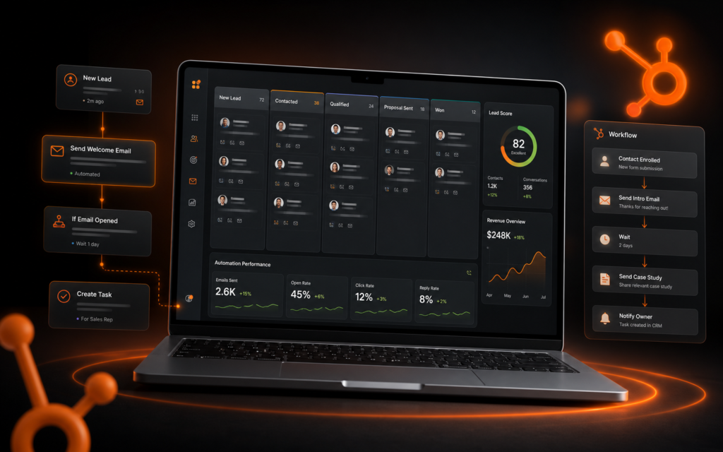
Brand experience inside the product — clear UI language, consistent visual system, a tone that feels helpful rather than bureaucratic — directly affects whether new users successfully activate and whether existing users feel loyal to the product or indifferent. The best SaaS companies treat their product interface as a brand touchpoint, not just a functional tool.
It Enables Product-Led Growth
PLG works when users become advocates. Users become advocates when they feel good about the product — and brand plays a significant role in how users feel. A product with strong brand identity and a clear voice gets shared, recommended, and included in comparison articles. A generic-feeling product gets used until something slightly better comes along.
SaaS brand identity
Is your SaaS brand losing deals before the demo?
Get a specialist brand identity built for SaaS — positioned for enterprise buyers, designed for product-led growth, and built to scale with your team.
The SaaS Branding Mistakes That Slow Growth
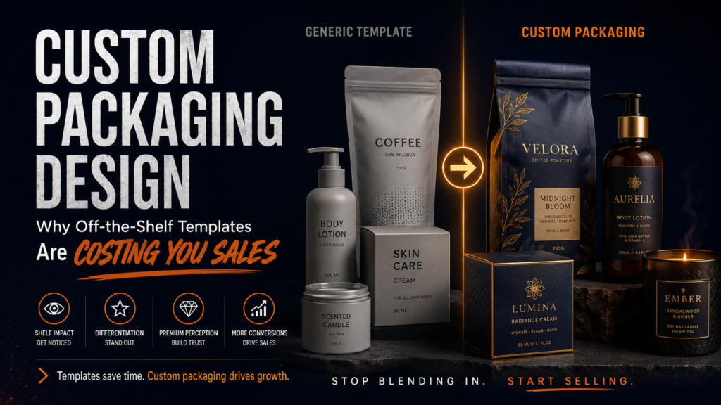
Generic Visual Design
Blue-and-white gradient hero sections. Stock photography of people smiling at laptops. Circular geometric logos. Clean sans-serif everything. This is the default aesthetic of 60% of SaaS marketing sites, which means it’s also the default for being ignored. When your brand looks like every other product in your category, buyers default to the incumbent they already know or the one with the lowest price. Differentiated visual design is a competitive advantage — and most SaaS companies have left it on the table.
Positioning That Describes Features Instead of Outcomes
Most SaaS homepages lead with what the product does rather than what it achieves. “AI-powered project management platform” describes a category. “Your team ships two weeks faster, every sprint” describes an outcome. Buyers don’t buy software — they buy the result the software enables. Brand positioning that speaks in outcomes converts significantly better than positioning that speaks in features.
Voice Inconsistency Across Touchpoints
When the marketing site sounds enthusiastic, the product emails sound corporate, the error messages sound apologetic, and the knowledge base sounds technical — buyers feel the inconsistency even if they can’t name it. A brand without a defined voice gets interpreted differently by every person who writes for it. That inconsistency erodes the trust that brand consistency would otherwise build.
Rebuilding Brand at Every Funding Round
Many SaaS companies go through a partial rebrand at seed, another at Series A, and another at Series B. Each rebrand costs time and money and resets brand recognition that had been building. The companies that avoid this build a brand system at seed that is designed to scale — not just to look good at the current stage. Understanding what a SaaS brand identity system should include at each stage helps founders invest appropriately rather than over-building or under-building.
SaaS Branding at Each Stage of Growth
What a Strong SaaS Brand System Includes
Positioning Statement
A single sentence that defines: who the product is for, what category it belongs to, what it does that nothing else does, and why that matters. This isn’t your tagline — it’s your internal compass. Every brand decision gets tested against it.
Visual Identity Built for Digital
SaaS brands live almost entirely in digital environments. The logo needs to work at 16px in a browser tab and at full-screen on a demo screen. The color palette needs to pass WCAG 2.1 accessibility contrast standards for product UI. The typography needs to be available as a web font with licensing that covers your expected traffic scale. These are constraints that generic brand identity work ignores and SaaS-specific brand work solves for.
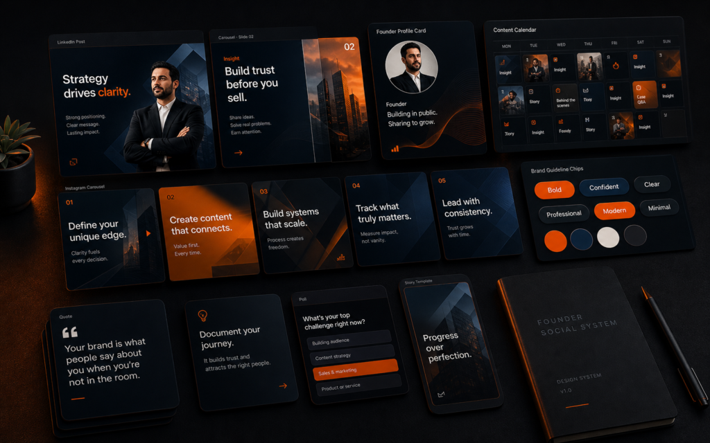
Brand Voice That Scales
A voice document that covers tone, vocabulary, sentence length, and personality — with concrete before/after examples — lets every future team member (copywriter, product designer, customer success manager) stay on-brand without a brand review on every piece of content they produce.
Competitive Differentiation Built In
Great SaaS branding makes the competitive positioning visible. A buyer comparing your product to three alternatives should be able to identify immediately, from the website alone, what makes you different and whether that difference matters to them. Vague differentiation claims (“better,” “smarter,” “more powerful”) make the buyer’s job harder — and buyers default to the option that feels safest when they’re uncertain.
Founders who build strong SaaS brands early find it directly supports their growth channels. A clear, differentiated brand makes paid acquisition more efficient, product-led viral loops more effective, and content marketing more shareable. The same operational thinking that builds a scalable SaaS sales funnel applies to brand: get the system right, then scale the system.
How to Find the Right SaaS Brand Designer
SaaS branding requires a designer who understands both the technical constraints of digital design and the strategic context of B2B software buying. The portfolio should include SaaS or B2B tech clients — not because other industries don’t transfer, but because the specific constraints (UI color systems, enterprise buyer psychology, product-led brand experience) require category familiarity.
Ask any candidate: “How does your process account for WCAG accessibility requirements in the color palette?” and “How would you approach brand guidelines for a product that has both a self-serve and an enterprise motion?” The answers tell you whether they’ve solved these problems before or are encountering them for the first time in your project.
SaaS Brand Design System: Technical Foundations That Hold Up at Scale
A brand identity document is not the same as a brand design system. The document tells you what to do. The system gives you the files, components, and infrastructure to actually do it at scale — across a growing team, multiple products, and an evolving product interface.
Design Tokens as Brand Infrastructure
Design tokens are the technical implementation of brand decisions: color variables, typography scales, spacing units, and shadow values stored as named values that connect the brand guidelines to the product codebase. When brand colors are stored as tokens rather than hard-coded hex values, a brand refresh updates every product UI, every marketing page, and every email template from a single source. SaaS companies that skip design tokens at seed find themselves doing manual find-and-replace across hundreds of files at Series A. The ones that implement them early update the entire brand in hours.
Component Libraries and Brand Consistency in Product UI
Every button, input field, card, tooltip, and modal in your SaaS product is a brand expression. If different engineers implement the same component differently, the product’s visual consistency erodes in proportion to the size of the engineering team. A component library — whether built in Figma, Storybook, or both — enforces brand consistency at the implementation level, not just the design level. SaaS brands with strong component libraries look polished at enterprise demos because every screen follows the same visual logic, regardless of which feature or engineer built it.
Typography That Works in Product and Marketing
Many SaaS brands choose a beautiful editorial typeface for marketing and a different font for the product — and then spend years managing the visual gap between them. The better approach: select primary and secondary typefaces that work in both contexts from the start. The primary typeface should have a web-optimized version with the weights you’ll need for both marketing headlines and product UI labels. The secondary typeface handles body copy across both contexts. When marketing and product use the same type system, the brand feels coherent end-to-end — from the landing page through the onboarding flow to the core product experience.
Color Accessibility in SaaS Product Design
WCAG 2.1 AA requires a minimum 4.5:1 contrast ratio for normal text and 3:1 for large text. For SaaS products serving enterprise clients — especially those in regulated industries like healthcare, financial services, or government — AA compliance is a baseline requirement, not a nice-to-have. Some enterprise procurement checklists include an accessibility audit. A brand palette that fails contrast requirements doesn’t just create a poor user experience; it can disqualify the product from procurement in key verticals. Build accessibility into the color palette at the brand design phase, not as a fix after the product is built.
Brand Governance Across a Growing Team
The biggest brand consistency challenge in a growing SaaS company is not the design team — it’s everyone else. Sales makes their own slide deck. Marketing produces a campaign that uses an off-brand font. A new engineer picks a color that’s close but not quite right. Brand governance is the system that prevents this without creating bottlenecks: a shared Figma library that auto-updates across files, a brand portal where anyone can download the right assets, and clear guidelines on what decisions require design review and what decisions team members can make independently. SaaS companies that build governance infrastructure early find that brand consistency scales with headcount rather than degrading with it.
Build a SaaS Brand That Wins Before the Demo
Lalit Bahel’s SaaS brand identity design service builds brand systems specifically for software companies — positioned for enterprise buyers, designed for digital-first environments, and built to scale from seed to Series B without a rebuild. Every engagement delivers a logo system, color palette, typography, voice guidelines, and brand standards built for the SaaS context.
SaaS brand identity
A brand built for how SaaS buyers actually decide.
Visual identity, positioning, brand voice, and design system — built for digital-first environments and enterprise buying committees.