Why Logo Design Is the First Serious Investment a Startup Must Make
A startup’s logo is the first thing investors read before they read your deck. It’s the first thing a potential customer notices on your website. Before a single word of copy lands, your logo has already transmitted a signal—competent or amateur, premium or generic, trustworthy or forgettable. For startups operating in crowded markets, that split-second impression can mean the difference between a warm handshake and a closed tab.
This guide is for founders who know they need a strong logo but aren’t sure what “strong” actually means, how the process works, or how to evaluate what they receive. By the end, you’ll be able to brief a designer, evaluate a concept, and avoid the three most expensive mistakes startup founders make with logo design.
“A logo is not your brand. But it is the entry point to your brand. Get it wrong and you’re fighting uphill before you’ve even started.” — Marty Neumeier, The Brand Gap
What Makes a Logo Work for a Startup
A startup logo operates under constraints that mature-brand logos don’t face. You don’t have years of brand equity to make an imperfect logo recognizable through sheer repetition. You don’t have the media budget to cement associations. Your logo has to do more work, faster, with less support. That means five non-negotiable qualities:
1. Scalability
Your logo will appear at 16px (browser favicon) and at 2000px (trade show banner). A design with fine detail, tight letter-spacing, or layered gradients will become unreadable at small sizes and will print badly. Every startup logo needs a simplified “icon-only” or “stacked” variant that works at 24px. If your designer hasn’t provided these, the job isn’t done.
2. Versatility Across Media
Startups appear on white websites, dark-mode apps, physical packaging, business cards, Slack workspaces, and product screenshots. Your logo needs a full-color version, a single-color (black) version, a reversed (white on dark) version, and a monochrome version. Four variants minimum. Any designer who delivers only one is leaving you with an incomplete toolkit.
3. Distinctiveness in Context
The right question isn’t “does this look good?” It’s “does this look different from every other company in my space?” Pull up the top 10 competitors in your category and lay their logos side by side. Where do the patterns cluster? Colors? Shapes? Typographic styles? Your logo should position itself clearly outside those clusters—or intentionally, deliberately align with them for a strategic reason (entering a trust-driven category where convention signals legitimacy).
4. Longevity
Startup logos go through a lot of versions in the early years. The goal is to choose something that won’t need a complete overhaul every 18 months. That means avoiding trend-driven choices: no gradients-within-gradients, no ultra-thin geometric letterforms currently popular in fintech, no illustrative complexity that will feel dated in three years. Clean, principled, timeless design lasts longer and costs less to maintain.
5. Story Coherence
The best startup logos encode meaning. Not gimmicky hidden-arrow meaning, but genuine conceptual coherence between what the company does and the visual choices made. A healthcare startup whose logo uses angular, aggressive shapes creates cognitive dissonance. A B2B SaaS company whose logo looks like a children’s toy does the same. The design choices—color, form, typeface personality, spacing—should all reinforce the same story your product tells.
For a deep look at the full range of services that support this, see the branding and identity design service.
The Brief: What to Tell Your Designer Before They Start
The quality of your brief determines the quality of what you receive. A vague brief produces generic work. Here’s exactly what to include:
Logo Types: Which One Fits Your Startup
There are five main logo categories, and the right choice depends on your company name, your category, and how your logo will primarily be used.
Wordmark
Pure typography—your company name rendered in a custom or modified typeface. Works best when the name is short (one or two syllables), distinctive, and easy to say. Think: Google, FedEx, Slack. Strong for brand recognition in early stages because every impression of the logo also reinforces the name.
Lettermark
Initials only—one, two, or three letters in a designed lockup. Best when your full name is long and difficult to render legibly at small sizes. Requires significant brand-building investment because initials don’t communicate meaning on their own. Works for companies with strong verbal marketing budgets or in categories where acronym recognition builds quickly (IBM, HP).
Pictorial Mark
A standalone icon with no text. The Twitter bird, the Apple apple. Almost always wrong for early-stage startups because the icon carries no inherent meaning until you’ve spent years building association. Exception: when the icon is so conceptually direct (a camera app using a camera icon) that the connection is immediate.
Abstract Mark
A geometric or organic shape not representing any real-world object. Nike Swoosh, Pepsi circle. Requires the most brand investment to develop meaning because there’s no conceptual shortcut. Rarely the right choice for a startup with limited marketing resources.
Combination Mark
Icon plus wordmark, lockup together. The most practical choice for most startups. You get the flexibility of using them together on primary applications and the icon alone when size constraints require it. The wordmark builds name recognition; the icon builds visual recall. This format transitions cleanly into icon-only usage as your brand matures.
For most startups, a combination mark is the best starting point. It gives you versatility without requiring existing brand equity to carry a standalone icon.
Color Psychology for Startup Logos
Color is not decoration. It’s the fastest channel of emotional communication in your logo. Every color carries associations that your audience brings before you say a word.
The overcrowded column is where you need to be careful. If you’re building a fintech company and you want to use blue, you need a very specific, differentiated shade—and probably an unusual typographic treatment—to avoid blending into the sea of blue-logo fintech startups.
Typography in Startup Logos
Typeface choice is often where amateur logo design is most immediately visible. Common mistakes:
- Using a Google Font unmodified. Google Fonts are free and ubiquitous. If your logo uses Montserrat, Inter, or Raleway with zero modification, it reads as a template, not a brand.
- Choosing a decorative font for legibility reasons. Script, display, and decorative fonts are difficult to read at small sizes, often poorly kerned, and typically poor choices for combination marks.
- Ignoring letter-spacing. Even a good typeface needs thoughtful tracking and kerning adjustments to feel crafted rather than default.
- Mismatching type personality with brand personality. An ultra-geometric sans-serif for a warm, human-centered wellness brand creates subconscious dissonance.
The AIGA’s design standards resources at aiga.org offer additional guidance on professional typography practice for brand identity work.
The Design Process: What to Expect
Understanding the process helps you participate constructively and avoid the expensive misunderstandings that come from unclear expectations.
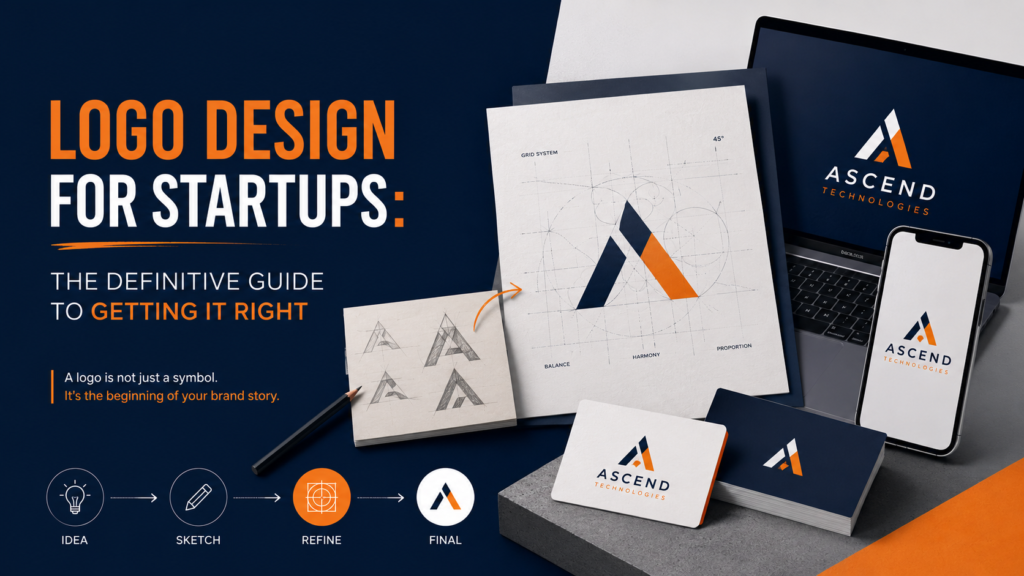
Phase 1: Discovery (Week 1)
Your designer conducts a thorough brief session, competitor audit, and category analysis. They map the visual landscape of your industry to identify differentiation opportunities. You should receive a visual strategy document or mood board that shows the design direction before any logo concepts are drawn.
Phase 2: Concept Development (Week 2)
Your designer develops 2–4 distinct directions. These should be genuinely different explorations, not variations on a single theme. Each concept should arrive with a rationale: why this direction, what it communicates, how it differs from competitors.
Phase 3: Refinement (Week 3)
You select a direction and provide structured feedback. Not “I don’t like it” but “the weight feels too heavy, and I’d like to test a darker shade of the green.” Revision rounds should be used for meaningful adjustments, not iterating to taste indefinitely.
Phase 4: Finalization (Week 4)
The chosen direction is refined to final quality, all variants are produced (full-color, mono, reversed, icon-only), and files are packaged in all required formats: SVG, PNG (transparent), PDF, and EPS. A basic usage guide should specify minimum sizes, clear space requirements, and approved/prohibited uses.
See how this process integrates with a full brand identity project at the brand identity design services guide.
File Formats: What You Should Receive
If you receive only a JPG, the job is incomplete. Vector formats (SVG, EPS, PDF, AI) are the master source files. Everything else is an export.
What a Startup Logo Typically Costs
Logo design pricing varies enormously based on experience, deliverables, and process rigor. Here’s a realistic breakdown:
For most pre-seed and seed-stage startups, a skilled mid-level or senior specialist freelancer is the right investment. You get rigorous process and professional deliverables without agency overhead.
Common Mistakes Startup Founders Make
Designing by Committee
Collecting opinions from every team member and advisor produces watered-down, compromise design. Logo decisions should involve 2–3 stakeholders maximum. Present a recommendation with rationale, not options for a vote.
Chasing Trends
The gradient-heavy, ultra-thin, or gradient-letterform styles popular in 2022–2024 will date your brand quickly. Design for longevity, not for what looks current on Dribbble this week.
Confusing Personal Taste with Brand Strategy
“I like blue” is not a brand decision. “Our target customer associates blue with trust, and our closest competitors use it inconsistently, so a specific shade of ocean blue differentiates us while leveraging category associations” is a brand decision.
Skipping the Brief
Designers who go straight to sketching without a thorough discovery process are producing output, not strategy. The brief is where the real work happens. A good designer will spend as much time on discovery as on execution.
Treating the Logo as the Brand
Your logo is the entry point. Your brand is the full system: the colors, typography, voice, values, and customer experience. A brilliant logo in service of a weak brand won’t save you. A solid logo in service of a strong brand compounds your equity every time someone sees it.
Next Steps: Building Your Brand System
Once you have a logo you’re confident in, the next step is building out the identity system that makes it work consistently across every touchpoint. That includes a color palette, typography system, brand patterns, photography style, and a usage guide that lets your whole team apply the identity without guessing.
If you’re a startup building from scratch, explore how the startup design services combine logo, brand system, and pitch deck into a coherent visual foundation. For the full scope of what a brand identity system includes, the brand design guide walks through each component in depth.
Ready to Build a Logo That Works as Hard as You Do?
A startup logo isn’t just a visual—it’s the first credibility signal every investor, customer, and partner encounters. Get it built right, with a process that starts with strategy and ends with a complete file package.