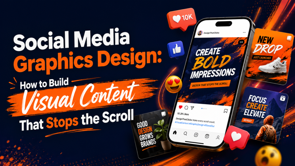
Social Media Graphics Design: How to Create Visual Content That Builds Brand Recognition and Drives Engagement
Social media is the most visible surface of your brand for most audiences. More people will see your Instagram post or LinkedIn graphic this week than will visit your website, read your email, or encounter your packaging. And yet most companies treat social media graphics as an afterthought — a task for whoever has time, using Canva templates that look like every other brand in the feed.
The result is social media content that is visually indistinguishable from competitors, fails to build brand recognition, and gets scrolled past before anyone reads the copy. The brands that win in social feeds have invested in a distinctive visual language — a design system that makes their content recognizable even when the logo isn’t visible, creates consistency across hundreds of posts, and builds cumulative brand equity rather than producing a stream of disconnected content.
This guide explains what professional social media graphics design involves, how to build a design system for social content, and what separates social visuals that build brands from ones that just fill a posting calendar.
“You have about three seconds to stop someone’s scroll. Your visual has to do all the work before they read a single word.” — Social media design principle
Why Social Media Visual Design Matters More Than Most Brands Think
Brand Recognition Requires Visual Consistency
Brand recognition is built through repeated exposure to consistent visual signals. Each time a customer sees your specific shade of blue, your distinctive typographic style, or your recognizable photography approach in their feed, they make a micro-association: this is that brand. Hundreds of micro-associations over months build the brand recognition that makes your content immediately identifiable even without a logo.
Brands that use inconsistent visual treatments across their social content — different color applications in different posts, mixed typography, no consistent photography direction — cannot build this recognition effect. Each post is starting from scratch rather than building on the previous ones.
Visual Quality Signals Brand Quality
The quality of your social graphics creates a halo effect on perceptions of your product, service, and company. A brand whose social content looks polished and professionally designed communicates operational quality and attention to detail. A brand whose social content looks like it was made in 10 minutes with a free tool communicates the opposite — regardless of the actual quality of the product or service behind it.
This signal is particularly important for service businesses, where the product is intangible and customers rely heavily on visible quality signals to assess whether the company can deliver. A graphic design studio with bad social graphics is incoherent at the brand level. A consulting firm with templates-from-the-internet visuals signals that they don’t invest in their own brand.
Platform-Specific Design Requirements
Every platform format requires its own design consideration, but they should all draw from the same visual identity system. Consistent application of brand colors, typography, and visual style across all these formats is what creates cross-platform brand recognition.
Building a Social Media Design System
A social media design system is the set of reusable templates, style rules, and asset libraries that enable consistent, high-quality social graphics at the volume social media requires. Without a system, every social post requires starting from scratch. With a system, every post maintains brand consistency while being produced efficiently.
Component 1: Brand Color Application for Social
Not all brand colors work equally well in social contexts. A primary brand color that looks premium on a website can appear different in a compressed JPEG thumbnail. A dark background color that works beautifully on a web page can produce a visually heavy Instagram grid. The social design system should specify:
- Which backgrounds are approved for social contexts
- Approved color combinations for text-over-color compositions
- How to handle the platform-specific color rendering differences between iOS and Android, different browsers, and light vs dark mode
- Minimum contrast ratios for text legibility on each approved background
Component 2: Typography Rules for Social
Typography in social graphics requires a different calibration than typography on websites or in print. Key considerations:
- Minimum size: Text on social images is viewed on phones at varying sizes. Text smaller than 18px on a 1080px image will be illegible on many devices.
- Text hierarchy: Social graphics typically need a clear primary message (the first thing the eye goes to) and secondary context. More than two levels of text hierarchy creates visual noise.
- Character limits per graphic: Fewer words communicate faster and create more visual impact. The discipline of limiting text on social graphics is one of the hardest editorial skills in brand content.
- Text placement zones: Consistent placement of text in each template (always headline in the upper third, always CTA in the lower left) builds visual recognition across a content series.
Component 3: Photography and Illustration Direction
A consistent photography or illustration direction is often the single biggest visual differentiator for social media brands. This means: consistent color grading (a warm, high-key treatment for a wellness brand; a cool, high-contrast treatment for a tech brand), consistent subject framing (full-face portraits vs. environmental shots vs. detail close-ups), and consistent image selection criteria (what type of moment, environment, and subject is approved for brand use).
Component 4: Template Library
The template library is the practical tool that makes the design system usable at scale. A well-built social template library includes:
- 3–5 layout templates per platform format (one quote, one stat highlight, one product feature, one announcement, one behind-the-scenes)
- All templates built on the brand color system and type hierarchy
- Locked elements (logo placement, brand color zones) that cannot be modified by non-designers
- Editable zones clearly identified for content replacement
- Templates organized by platform in a shared design file (Figma, Canva Teams, or Adobe)
Content Types That Drive Engagement: Design Implications
Different content types serve different engagement goals, and each has specific design requirements:
Educational/Value Content
Tips, frameworks, how-tos, and statistics. Design priority: clarity and scannability. The information must be digestible quickly. Clean layout, high contrast, minimal decoration. Carousel formats work well for multi-step content; single images work well for single-stat highlights.
Brand Personality Content
Behind-the-scenes, team culture, values expression. Design priority: authenticity and warmth. Photography quality matters more here than template polish — authentic moments with good lighting communicate more than polished graphics of manufactured scenarios.
Product/Service Showcase
Product photography, service demonstrations, case study highlights. Design priority: the product or result is the visual hero. Backgrounds should recede; the product or outcome should dominate. Premium treatment elevates the product’s perceived value.
Social Proof
Customer quotes, reviews, and testimonials. Design priority: the customer’s voice is the content; the design is the amplifier. Quote graphics should make the testimonial read at a glance and communicate the credibility context (who said it, why it matters) efficiently.
Promotional/Campaign
Offers, launches, events, deadlines. Design priority: urgency and clarity. The offer must be immediately legible. CTA must be prominent. These graphics have a limited shelf life — design them to communicate fast, not to last.
For a full-service approach to social content design that’s integrated with your brand identity system, see the content and social media design service. For the brand identity foundation that all social design should build from, see the brand identity design services guide.
Social Media Graphics and Your Brand System
Social graphics that are developed independently of the brand identity system create visual fragmentation: the website looks one way, the pitch deck looks another, and the social content looks like a third brand. This fragmentation erodes the compounding effect that brand consistency enables.
The most effective social media design systems are built as extensions of the core brand identity: using the same color palette, the same typefaces, the same photography direction, and the same visual personality. The result is cross-platform brand recognition that builds with every post, every week, across every channel your audience encounters your brand.
For businesses automating their content workflows — scheduling, variant generation, and platform-specific exports — the AI workflow automation service can connect your design system to automated distribution. For questions about building a social design system for your brand, start a conversation.
Social Graphics That Build Your Brand, Not Just Fill Your Calendar
Social media is where most people encounter your brand. Make it count. A proper social design system gives you templates that are fast to use, consistently on-brand, and distinctive enough to build recognition in feeds crowded with generic content. Let’s build yours.