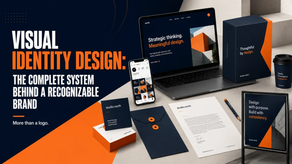
Visual Identity Design: The Complete Guide to Building a Recognizable Brand
A brand’s visual identity is the collection of design elements that express who you are without saying a word. It’s the color someone recognizes before reading the company name. It’s the typographic personality that signals premium versus approachable, technical versus human, bold versus restrained. It’s the system that makes every customer touchpoint feel like it came from the same organization.
Visual identity design isn’t logo design. A logo is one element of a visual identity. A complete identity system is the full suite of visual decisions—logo, color, typography, imagery, motion, pattern, iconography—that work together to create a coherent, distinctive, and memorable brand presence.
This guide explains what a visual identity system includes, how it’s built, and what distinguishes a system that builds brand equity from one that looks good in a presentation but falls apart in practice.
“Visual identity is not about decoration. It’s about recognition, differentiation, and trust—built one consistent impression at a time.” — Design Council UK
Why Visual Identity Is a Business Asset, Not a Design Deliverable
Most founders think of visual identity as something you commission from a designer, receive as a file package, and then use. That mental model misses what visual identity actually does.
A coherent visual identity reduces the cognitive load required for a customer to trust you. Every time someone encounters a brand expression that matches their previous experience—whether that’s a website, an email, a product UI, or a business card—their brain registers consistency as reliability. Inconsistency registers as disorder. In categories where trust is a purchasing driver (services, healthcare, financial products, B2B software), this dynamic is directly tied to conversion and retention.
Research from the Design Management Institute shows that design-driven companies outperform the S&P 500 by 219% over 10 years. That outperformance isn’t explained by any single design decision—it’s the cumulative effect of systematic, consistent design across every customer touchpoint. Visual identity is the infrastructure that makes that consistency possible.
For startups specifically, a strong visual identity does additional work: it signals operational maturity to investors, creates a talent recruitment advantage, and establishes the premium positioning that supports higher pricing.
The Seven Elements of a Complete Visual Identity System
1. Logo and Logo System
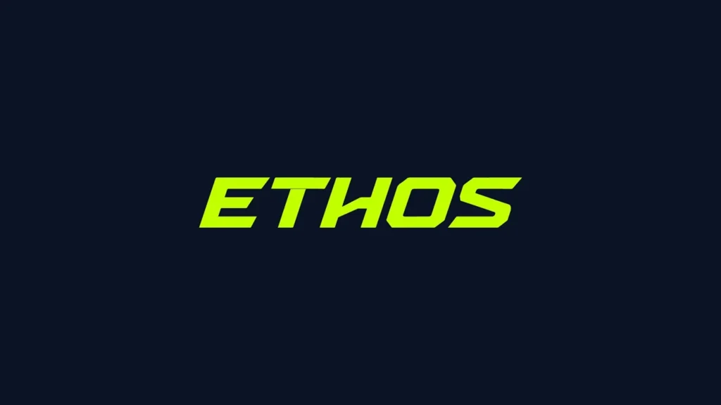
The primary mark, plus all its variants. A complete logo system includes the master lockup (icon + wordmark together), variants for different layout contexts (stacked, horizontal, icon-only), and reversed and monochrome versions for different backgrounds. The logo is the most recognizable element of the identity, but its value depends entirely on the system that surrounds it.
2. Color Palette
Not just the colors—the rules for using them. A brand color palette specifies primary colors, secondary colors, and neutral/background colors, with exact values for every medium: hex for web, RGB for screens, CMYK for print, Pantone for professional production. It also defines usage hierarchy: which colors lead, which support, which accent.
3. Typography System
A two or three-typeface system with defined roles: one for display and headlines, one for body copy, optionally one for UI or data contexts. Typography is where brand personality lives most visibly in the absence of imagery. A sharp, geometric sans-serif communicates something fundamentally different from a warm, humanist sans or a structured serif.
4. Imagery and Photography Direction
Art direction for photography: what subjects, environments, lighting, color grade, and composition approach align with the brand. This element is frequently underspecified in brand guidelines and frequently responsible for visual inconsistency—the website looks premium, the social media posts look like stock photos, and the product marketing looks like a different company entirely.
5. Iconography and Illustration Style
For digital brands, icon and illustration style is a major differentiator. A consistent icon library with defined line weight, corner radius, metaphor approach, and complexity level creates visual coherence across UI, marketing, and presentation contexts. Illustration style—if your brand uses custom illustration—needs to define character design principles, color palette application, and appropriate contexts.
6. Motion and Animation Language
As digital brands increasingly use animation in UI, video, and social media content, motion has become a visual identity element. What’s your brand’s easing curve? What’s the duration range for micro-interactions? Does your brand feel snappy and energetic or smooth and deliberate? These decisions should be specified, not left to each animator to interpret independently.
7. Design Patterns and Graphic Elements
The supporting cast of visual elements: textures, background patterns, decorative shapes, dividers, masks, and graphic devices that appear across marketing materials and create a distinctive visual texture. These are often the elements that make a brand feel “complete” and “designed” rather than functional-but-bare.
The Visual Identity Design Process
Phase 1: Discovery and Brand Audit
Before any design begins, a thorough understanding of the brand’s context is essential. This means analyzing competitors’ visual identities to map the category’s visual landscape, understanding the target audience’s aesthetic expectations, reviewing existing brand assets for what’s working and what isn’t, and clarifying the brand’s strategic positioning—what it stands for and who it’s for.
This phase produces a creative brief and, often, a visual strategy document that defines the design direction before execution begins. Skipping this phase is the single most common reason visual identity projects produce generic or misaligned work.
Phase 2: Concept Exploration
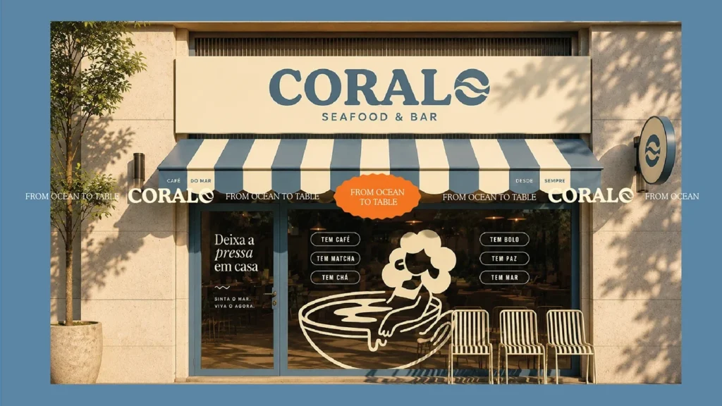
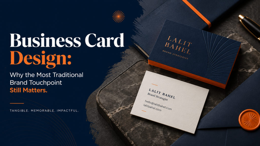
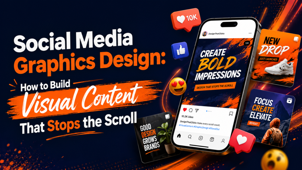
The designer develops 2–4 distinct visual directions—different interpretations of what the brand could look like, each rooted in the strategic brief. Strong concept presentations show each direction applied to real touchpoints (website header, business card, social media post) rather than logos floating in white space. This context shows how the identity will actually function.
Phase 3: Direction Selection and Refinement
The client selects a direction (or a synthesis of elements from multiple directions) and the designer refines it to final quality. This phase involves detailed typographic work, exact color specification, logo refinement at the pixel level, and the development of all variants and supporting elements.
Phase 4: System Development
With the core elements finalized, the full system is built: all logo variants, complete color palette with all format values, typography hierarchy, imagery direction, supporting graphic elements, and templates for common use cases. This is where a “logo project” becomes a “visual identity system.”
Phase 5: Documentation
Brand guidelines codify everything: the rules for using each element, the rationale for each decision, examples of correct and incorrect use, and file formats for every context. Without this documentation, the system lives in the designer’s head, not in your organization’s hands.
Visual Identity for Different Business Categories
Different business types face different visual identity challenges. The design approaches that work for a consumer app are often wrong for a B2B SaaS company, which are often wrong for a healthcare service provider.
B2B and SaaS Companies
B2B visual identity needs to balance credibility with differentiation. The common mistake is defaulting to “professional” in a way that produces generic blue-and-gray tech company branding. The opportunity is to establish distinct visual personality while maintaining the authority signals that enterprise buyers require.
For B2B SaaS brand identity systems specifically, the SaaS brand identity design service covers the specific considerations of software company identity work. For more detail on what distinguishes SaaS branding, see the SaaS branding guide.
Healthcare and Medical Companies
Healthcare visual identity must balance clinical authority with human warmth. Patients and healthcare professionals need different signals—institutional credibility, approachability, and clear differentiation from the generic visual language of medical stock photography. This category requires particular attention to accessibility: color contrast, typography legibility, and imagery inclusion are all regulatory and ethical requirements, not stylistic choices.
For healthcare-specific design guidance, see how to choose a graphic designer for healthcare.
Consumer Brands
Consumer visual identity often has the most latitude for personality and expressiveness. The challenge is creating something distinctive enough to cut through market noise while remaining accessible to a broad audience. Typography and color are frequently the primary differentiators; custom illustration and strong art direction often separate leading consumer brands from the field.
Professional Services
Law firms, consultancies, and professional services firms often under-invest in visual identity because they believe their work speaks for itself. But in a market where credibility must be established at first impression—before a prospect has experienced your service—visual identity is an early qualifying signal. The right investment level creates competitive advantage; the wrong level (dated website, inconsistent materials) creates doubt.
Visual Identity and Corporate Identity: Understanding the Difference
Visual identity and corporate identity are related but distinct concepts. Visual identity refers to the design system: logos, colors, typography, imagery. Corporate identity is the broader concept that encompasses visual identity but also extends to the behavioral and cultural dimensions of how an organization presents itself—its mission, values, communication style, and the experiences it creates.
A strong visual identity should be informed by and coherent with the corporate identity it represents. A company that defines itself as “transparent and accessible” but uses complex, inaccessible typography and cold, distant photography has a misalignment between its stated values and its visual expression. That disconnect is perceived, even when it’s not consciously articulated, by customers and employees alike.
For the corporate identity design component of this system, see the corporate identity design guide.
Evaluating a Visual Identity: What to Look For
Whether you’re reviewing a proposed identity for your own brand or evaluating a potential vendor’s portfolio, these criteria distinguish strong identity work from adequate work:
Building Your Visual Identity: DIY vs. Hiring a Professional
The honest answer: for early-stage startups (pre-seed, revenue under $500K), a DIY approach using well-chosen tools and stock type is defensible as a placeholder. Canva’s brand kit, a Google Font pairing guide, and a carefully chosen Unsplash photography direction can produce a coherent-enough visual presence while you validate product-market fit.
But this approach has a ceiling. As soon as investor presentations, hiring, and enterprise sales become material to your growth, the DIY visual identity starts costing you more than the professional alternative would have. Investors compare you visually to your competitors. Enterprise buyers signal-read your materials before they read your content. A senior hire evaluating two similar offers will be influenced by which company’s materials communicate “this organization has its act together.”
The right time to invest in a professional visual identity system is before you need it—typically at initial fundraise or first meaningful revenue milestone. The branding and identity design service is built for startups at exactly this stage.
Ready to Build a Visual Identity That Scales With Your Brand?
A complete visual identity system is the foundation everything else is built on—your website, your pitch deck, your product, your marketing. Built right, it creates recognition and trust before you say a word. Built wrong, it works against you.