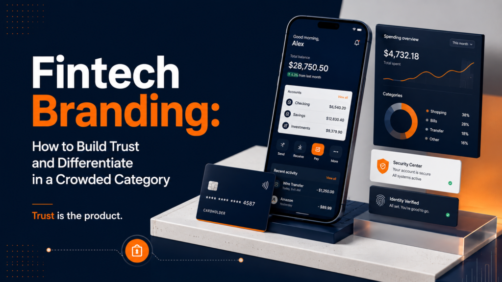
Fintech Branding: How to Build Trust, Differentiate, and Win in the World’s Most Crowded Startup Category
Fintech is one of the most difficult branding environments in the startup world. You’re asking people to trust you with their money, their financial data, and their financial future. The audience is sophisticated about design (because they’re comparing you to incumbents like Chase and Citi as much as to peer startups), highly sensitive to trust signals, and deeply risk-averse when it comes to anything that touches their finances.
At the same time, the visual landscape of fintech branding has become extraordinarily crowded and homogeneous. The “modern fintech” aesthetic—clean sans-serif wordmark, gradient accent, blue or green primary color, lifestyle photography with subtle financial overlay graphics—has been adopted so broadly that it’s now the category’s invisible wallpaper rather than a differentiating signal.
This guide is for fintech founders and marketing leaders who understand that branding in their category requires more sophistication than simply “looking professional and modern.” It covers what genuinely drives trust in fintech, how to differentiate in a crowded visual landscape, and what a fintech brand system needs to accomplish that a generic startup brand system doesn’t.
“In financial services, trust is not a differentiator. It’s the price of entry. Differentiation happens above the trust threshold.” — Mark Ritson
The Unique Constraints of Fintech Branding
Trust Is Non-Negotiable
Every element of a fintech brand must first pass the trust test before it can do any other work. Color choices, typeface personality, photography direction, copywriting tone—all of these are evaluated first through the lens of “does this feel like a company I would trust with my money?” before they’re evaluated for any other quality. This is a harder constraint than most brand categories face.
Regulatory Context Creates Tone Constraints
Fintech operates in a regulated environment. Claims about returns, performance, and risk must meet legal standards. This creates a specific tension in brand voice: regulatory caution tends to produce cautious, hedge-everything copy that undermines brand confidence. The best fintech brands find the intersection of legally sound and genuinely confident—they don’t hide behind disclaimers, but they also don’t make promises they can’t legally defend.
You’re Being Compared to Both Startups and Banks
Fintech users are evaluating you against two reference points simultaneously: the legacy banking and financial institutions they’re familiar with (Chase, Citi, Schwab) and the startup alternatives they’ve heard about (Robinhood, Stripe, Chime, Plaid). You need to signal enough institutional credibility to beat the banks on trust, and enough innovation and personality to beat the legacy players on experience. Neither reference point alone is the right model.
The Target Audience Spans Sophistication Levels
A consumer payments app, an enterprise treasury platform, and a retail investment tool may all call themselves “fintech,” but their target audiences read brand signals completely differently. Consumer fintech users care primarily about simplicity and safety. Enterprise fintech buyers care about compliance, integration, and institutional credibility. Retail investors care about transparency and fairness. The brand needs to be built for a specific audience, not “financial services users” in the abstract.
The Anatomy of a Trust-Building Fintech Brand
Visual Stability
Visual stability—the feeling that a brand is established, consistent, and doesn’t make sudden changes—is one of the strongest trust signals available to fintech brands. This is achieved through consistent application of a restrained visual system across every touchpoint. It’s the opposite of the brand that changes its look every time they run a new campaign.
Practically, visual stability means:
- A logo used consistently, without variations or experiments
- A color palette applied with discipline, not freely expanded with “seasonal” additions
- Typography that doesn’t change based on designer preference
- Photography and imagery that follows a consistent art direction
Restraint
In fintech, less is more. The visual restraint of established financial brands—minimal color palette, clean typography, careful use of imagery—signals that the company is serious and focused rather than playful and experimental. Restraint in fintech branding is the visual equivalent of a firm handshake: it signals competence without overstatement.
Precision
Precision in design detail—tight typography, deliberate spacing, careful color specification—correlates with precision in product and operations in the minds of customers and investors. A sloppy brand suggests a sloppy company. A brand with obvious typographic errors, inconsistent spacing, or off-brand color applications raises implicit doubt about whether similar carelessness extends to the product.
Clarity of Purpose
The most trusted fintech brands communicate exactly what they do, for exactly whom, and why that matters—immediately, without ambiguity. Clarity is a trust signal because ambiguity creates the impression of hiding something. Stripe’s “financial infrastructure for the internet” and Plaid’s “making financial services better for everyone” are examples of positioning clarity that builds confidence rather than raising questions.
Fintech Visual Identity: Breaking Out of the Blue Box
The dominant fintech color palette is blue. Dark navy for institutional credibility. Bright blue for tech-forward optimism. Teal for the space between trust and innovation. Fintech brands cluster so heavily around blue that blue itself has become a category shorthand rather than a differentiating signal.
The strategic opportunity in fintech color is to understand which signals the category has saturated and which are available. In 2026, there’s more open space in warm tones, rich neutrals (warm grays, off-whites with character), and carefully chosen accent colors than in the blue-green spectrum that has dominated the category.
Fintech Typography: What Works and Why
Typography in fintech brands carries more weight than in most categories because financial content is dense and heavily text-driven. Balance sheets, terms of service, transaction histories, and financial reports are the primary content surfaces for many fintech products. Typography that serves this content beautifully—legible at small sizes, scannable in long-form, differentiating at display sizes—is a genuine functional advantage.
The dominant fintech typographic approach—geometric sans-serif (Inter, Neue Haas Grotesk, or similar) in varying weights—is clean and functional but has become the category default. Brands using well-chosen humanist sans-serifs, refined contemporary serifs, or custom-modified typefaces differentiate more effectively while maintaining the legibility requirements of financial content.
Fintech SaaS vs. Consumer Fintech: Different Brand Requirements
B2B fintech (payments infrastructure, treasury management, risk platforms, banking APIs) and consumer fintech (personal finance, retail investment, payments apps) require fundamentally different brand approaches.
The mistake is trying to bridge these two audiences with a single brand system. If your product genuinely serves both enterprise and consumer audiences, consider a brand architecture that allows different sub-brand expressions for each, rooted in the same master brand but adapted to different audience expectations.
For B2B and SaaS-specific brand identity design, see the SaaS brand identity design service. For the broader brand strategy that should underpin fintech brand decisions, see the branding strategy guide.
Fintech Brand Voice: Regulatory Clarity Without Bureaucratic Paralysis
Fintech copywriting has a specific pathology: legal review turns confident brand voice into hedge-everything corporate speak. The result is copy that’s technically accurate but brand-destroying: nobody is inspired by “past performance is not indicative of future results” written in 8-point type beneath a lifestyle image of someone looking optimistically at a phone screen.
The solution isn’t to ignore regulatory constraints—it’s to build a brand voice that works within them. Strong fintech brand voice principles:
- Separate claim from context. Make the emotional claim confidently. Add the regulatory disclaimer clearly but separately. Don’t undermine the claim with hedging built into the claim itself.
- Educate with specificity. Fintech customers are hungry for clarity about how money works. Brand voice that teaches rather than obfuscates builds trust and authority simultaneously.
- Be honest about limitations. Paradoxically, acknowledging what your product doesn’t do well builds more trust than pretending it’s perfect. Users know when marketing is overselling.
- Human over technical. Write about financial outcomes in human terms. “Save more, stress less” and “know exactly where your money goes” speak to the emotional reality of financial management in ways that feature lists don’t.
Fintech Brand and Product Design Alignment
In fintech, the product interface is the most-experienced brand touchpoint. More than the website, more than marketing materials, more than any advertising—the product is where brand experience is built or destroyed. A brand identity built without alignment to the product’s design system creates a schizophrenic user experience: the marketing promises one brand, and the product delivers another.
Effective fintech brand design requires close coordination between brand identity and product design: the same color system, the same typographic hierarchy, the same grid principles, the same voice. When marketing and product speak the same visual language, every interaction with the brand compounds trust rather than fragmenting it.
If you’re building a fintech brand identity and want to ensure it extends correctly into product and marketing, see the branding and identity design service or talk about your specific project.
Fintech Brand That Earns Trust and Earns Customers
In fintech, your brand is your trust infrastructure. It signals to every user, investor, and partner whether you’re a company worth putting money into. Build it right, and it works for you before anyone opens your app or reads your pitch deck.