What Are Brand Guidelines and Why Every Startup Needs Them Before They Think They’re Ready
Ask ten startup founders whether they have brand guidelines and nine will say “we have a logo.” Ask the same founders whether their website, pitch deck, social media, and product screenshots look like they came from the same company, and most will hesitate. That gap—between having a logo and having a brand system—is what brand guidelines close.
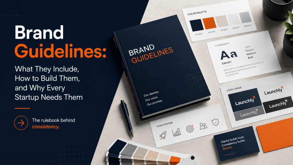
Brand guidelines (also called a brand style guide, brand manual, or visual identity system) are the document that turns a logo into a brand. They define every visual and verbal decision that makes your company recognizable across every surface it touches. This guide explains what should be in yours, how to build it, and how to use it so your brand compounds over time instead of fragmenting.
“Consistency is the key to building brand recognition. Brand guidelines are how you achieve consistency at scale.” — Design Council UK
Why Brand Guidelines Matter More for Startups Than for Enterprises
Enterprises have brand guidelines because they have hundreds of employees applying the brand across dozens of markets, and without rules, chaos ensues. Startups might assume they don’t have that problem yet—the team is small and everyone can just “keep it consistent.” That assumption is expensive.
Here’s why startups need guidelines earlier than they think:
- Every new hire is a new brand decision-maker. The moment you hire a second person who creates any content—a blog post, a social graphic, a sales deck—you have two different interpretations of your brand unless there’s a reference document.
- Every vendor uses them. Printers, developers, social media managers, PR agencies, and contractors all need to apply your brand. Without guidelines, each one invents their own interpretation.
- Inconsistency undermines trust. Research consistently shows that consistent brand presentation increases revenue. Inconsistency—a different shade of your brand blue on every touchpoint, mismatched typefaces, logos at wrong proportions—signals organizational chaos to potential customers and investors.
- Guidelines are cheaper to build now than to retroactively enforce later. Rebuilding brand consistency across a portfolio of existing assets is far more expensive than building guidelines alongside your initial identity system.
See the full identity system that guidelines govern at the branding and identity design service page.
The Core Components of Brand Guidelines
1. Logo Usage Rules
Your logo section is the most detailed part of the guidelines. It covers:
- Primary logo and variants — full-color, single-color (black and white), reversed (white on dark background), and icon-only. Each variant has specific approved use cases.
- Clear space — the minimum amount of empty space that must always surround the logo. Usually expressed as a multiple of a logo element (e.g., “the X height of the ‘L’ in the wordmark”). This prevents the logo from being crowded by other elements.
- Minimum size — the smallest the logo can appear and remain legible. Digital: typically 120px wide for the full lockup, 32px for the icon-only version. Print: typically 1 inch wide for the full lockup.
- Approved color combinations — which background colors each logo variant can appear on.
- Prohibited uses — the “don’t” section. Don’t stretch, don’t rotate, don’t add drop shadows, don’t change colors, don’t place on busy backgrounds that reduce legibility.
2. Color Palette
Brand guidelines specify colors with precision: hex codes (web), RGB values (screen), CMYK values (print), and Pantone numbers (professional print and merchandise). Approximation is the enemy of consistency—”roughly that shade of teal” produces a different result every time.
A well-built color palette includes:
- Primary brand colors — 1–3 colors that are the visual signature of the brand
- Secondary palette — supporting colors for UI elements, data visualization, or content variation
- Neutral palette — background colors, text colors, dividers, and grays
- Semantic colors — for products with UI: success (green), warning (yellow), error (red), info (blue)
- Usage ratios — guidance on proportion (e.g., primary color 60%, secondary 30%, accent 10%)
3. Typography System
Typography is the most powerful but most overlooked component of brand guidelines. Your type system defines:
- Typefaces — primary (usually the logo typeface or a closely related one), secondary (for body copy), and optionally a display typeface for large headlines
- Type hierarchy — H1, H2, H3, body copy, captions, labels, and their size and weight at desktop and mobile
- Line height and letter-spacing — the “invisible” settings that make text breathe and feel crafted
- Fallback fonts — for email and environments where custom fonts may not load
4. Imagery and Photography Style
Photography choices communicate brand personality as powerfully as any other element. Your guidelines should define:
- Style direction — high-contrast or soft, documentary or staged, warm or neutral
- Subject matter — what types of people, environments, and scenes are approved
- Color grading — does your photography have a consistent color treatment? (warm tone, desaturated, high key)
- Composition rules — how much white space, what angles are appropriate, cropping standards
- What to avoid — stock photo clichés, competitive products, specific scenarios that conflict with brand values
5. Iconography and Illustration
If your brand uses icons (in UI, presentations, or marketing), their style should be consistent: line weight, corner radius, size grid, and visual complexity level all need to match. An icon library with mixed metaphors and inconsistent styles signals a brand that wasn’t designed—it grew without oversight.
6. Brand Voice and Tone
Visual identity guidelines increasingly include verbal identity. Your voice guide defines how the brand sounds in writing:
- Voice characteristics — the adjectives that describe how you always sound (direct, warm, expert, conversational)
- Tone variations — how tone shifts by context (more formal in legal communications, more casual in social media)
- Vocabulary — terms the brand uses and avoids (do you call your users “users” or “members” or “customers”?)
- Writing principles — active vs. passive voice, sentence length, jargon policy
For a deep dive into how brand guidelines inform a startup’s overall brand strategy, see the startup branding strategy guide.
Three Levels of Brand Guidelines (Match the Format to Your Stage)
A brand starter kit covers logo usage rules, exact color values, typeface names, and two or three photography direction sentences. That’s enough for a two-person team. As you hire, design the guide you need now, not the guide you’ll need in five years.
How to Build Brand Guidelines: Step by Step
Step 1: Inventory Your Current Brand Assets
Collect every existing brand asset: all logo files, any colors currently in use, all typefaces, all templates (presentation, email, proposal). Note every inconsistency you find. These inconsistencies are exactly what the guidelines will resolve.
Step 2: Audit Current Usage Across Touchpoints
Pull screenshots of your website, social profiles, pitch deck, product UI, and any printed materials. Lay them side by side. Where do they diverge? Color inconsistencies, different logo sizes, mixed typefaces, and conflicting photography styles are all guideline violations waiting to be codified as rules.
Step 3: Define the Rules That Prevent Each Inconsistency
Every inconsistency you found in step 2 becomes a guideline. The rule format is: approved use + rationale + prohibited alternatives. Don’t just say “use this color.” Say “use this color because it’s the primary brand color—use it for all primary CTAs, headline accents, and brand touchpoints. Do not use the secondary blue in these contexts.”
Step 4: Build Templates for the Most Common Outputs
Guidelines tell people what the rules are. Templates make it easy to follow them. The highest-leverage templates for startups: email signature, presentation slide master, social media post templates (square, landscape, story), and business card layout.
Step 5: Publish in a Shared, Living Document
Brand guidelines aren’t a one-time PDF sent to employees during onboarding. They’re a living document that needs to be findable, linkable, and updatable. Figma, Notion, and Confluence all work. The format matters less than the accessibility and version control.
Using Brand Guidelines in Practice
Brand guidelines only work if they’re used. Three practices that drive adoption:
Brief Every New Vendor Immediately
Every contractor, agency, developer, or freelancer who touches your brand should receive the guidelines on day one, before any work starts. Not after you see the first draft and realize they’ve guessed wrong about your typography.
Include in Onboarding
Every employee who creates any content—even a presentation or email—should read the guidelines as part of their first week. Make them sign off that they’ve read it. This isn’t pedantry; it’s protecting the investment you’ve made in your brand.
Schedule a Quarterly Review
Brands evolve. New platforms appear. Product expansions require new visual elements. Assign one person (usually the head of marketing or design) ownership of the guidelines. Set a quarterly reminder to review for accuracy and gaps.
Brand guidelines are only as valuable as they are current and accessible. A PDF sent once and never updated is worse than no guidelines at all—it codifies a snapshot of your brand that may no longer be accurate.
Common Brand Guidelines Mistakes
Making Them Too Prescriptive
Guidelines that specify every possible scenario become so overwhelming that nobody reads them. Focus on the most common use cases and the most easily violated rules. A 5-page guide that gets used beats a 100-page guide that sits untouched.
Forgetting Digital-Specific Rules
Many traditional brand guides focus on print: CMYK values, print margins, business cards. Digital-first startups need digital-first guidelines: hover states, animation timing, favicon specifications, social media crop zones, dark mode logo variants.
No Prohibited Uses Section
The “don’ts” section is as important as the “dos.” Designers and non-designers alike will try things that seem reasonable but damage the brand: adding a shadow to the logo to make it stand out on a background, stretching the logo to fill a space, using the primary brand color as a background behind the logo. Every one of these needs to be explicitly prohibited, with visual examples.
Brand Guidelines and Your Expanding Identity System
Brand guidelines are the foundation. Once you have them, they enable everything else in your visual identity system to be built consistently: presentations, product UI, packaging, marketing campaigns, and content. The investment in clear guidelines pays dividends on every design project you commission going forward.
If you’re building a startup brand system from scratch, explore startup-focused design services that build guidelines alongside the identity, ensuring they match from day one. For the component-level thinking that goes into a full identity system, see the brand design overview.
Your Brand Deserves Rules Worth Following
A well-built brand guide transforms a logo into a system and a system into a competitive advantage. Whether you’re building guidelines from scratch or codifying what you already have, the right design partner makes the difference between a document that collects dust and one that drives consistency at scale.