Business Card Design: Why the Most Traditional Brand Touchpoint Still Matters in a Digital World
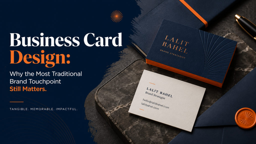
Every few years, someone announces that business cards are dead. And yet the business card persists — not out of nostalgia, but because the physical exchange of a well-designed card creates a brand impression that no digital alternative has replicated. A beautifully crafted business card is felt before it’s read. The weight of the paper, the texture of the finish, the precision of the typography — all of these communicate something about the company before the recipient has processed a single piece of information.
For founders, executives, and sales professionals, the business card is often the first physical artifact of a brand that a prospect, investor, or partner encounters. It sits in their wallet, on their desk, or in their card file — a persistent, ambient brand impression that outlasts the conversation that produced it. In a world where digital impressions evaporate in seconds, a well-designed card endures.
This guide covers what makes business card design effective, the production and print specifications that determine quality, the design decisions that differentiate premium from generic, and how to brief a designer for the results you actually want.
“A business card is the smallest canvas you’ll ever use to make the biggest impression. Every millimeter is working — or failing.” — Graphic design principle
Why Business Card Design Still Creates Competitive Advantage
The Physical Difference Principle
Physical objects occupy a different mental register than digital ones. A business card with significant weight, a distinctive texture, or an unexpected finish creates a sensory impression that a LinkedIn profile or email signature cannot. The premium experience of holding a well-crafted card creates brand association before the recipient has read anything on it — and that association transfers to the company it represents.
Persistence in Physical Space
Physical objects that don’t actively demand attention can persist in environments for much longer than digital content. A business card on a desk, in a wallet, or in a card holder creates repeated low-level brand impressions over days or weeks — a persistence that no digital touchpoint provides. The business card that earns a spot in someone’s permanent card collection creates ongoing brand equity long after the original meeting.
Signal in Context
The quality of a business card signals company quality in professional contexts. An enterprise sales professional handing over a flimsy, low-quality card undermines the credibility they’ve spent the entire meeting building. A founder presenting to investors while carrying a card that looks like it was designed for $10 on Vistaprint communicates something about how the company approaches quality. The premium business card signals premium company — and in high-stakes professional contexts, that signal matters.
Standard Business Card Dimensions and Formats
Non-standard formats can be powerful differentiators in professional contexts where standard cards are the norm. A square card, a mini card, or an unusually sized card stands out in any stack and creates a visual moment when handed over. The tradeoff is that non-standard formats don’t fit standard card holders — a practical consideration for recipients.
Paper Stock and Finish: Where Quality Is Made or Lost
The single most impactful design decision in business card production isn’t the layout or the typography — it’s the paper stock and finish. The physical experience of holding the card communicates brand quality before any information is processed.
Paper Weight
Standard business cards are typically 14pt–16pt cover stock (approximately 350–400 gsm). Premium business cards use 18pt–32pt stock — significantly heavier, with a substantiality that signals quality immediately. Ultra-heavy cards (24pt, 32pt, or duplex construction) create an impression that is genuinely surprising in professional contexts — they feel expensive because they are.
Surface Finish Options
Specialty Finishing Techniques
- Foil stamping: Metallic foil (gold, silver, copper, holographic) applied to specific design elements. Creates premium impression, particularly effective on dark or soft-touch backgrounds.
- Spot UV: Gloss coating applied to specific elements on a matte background. Creates visual and tactile contrast between coated and uncoated areas. Particularly effective for logo and brand elements.
- Embossing: Raised elements created by pressing from behind. Creates elegant tactile dimension without color. Often used for logos and names.
- Debossing: Pressed-in elements, the opposite of embossing. Creates a refined, understated dimensional effect.
- Edge painting: Colored ink applied to the card edges. Creates a distinctive visual when the card is held end-on or stacked. Available in any ink color.
- Die cutting: Custom card shapes cut to match logo or brand forms. Creates extreme visual differentiation; significantly more expensive.
Layout and Typography: The Design Essentials
Information Hierarchy
A business card typically carries: name, title, company name, phone, email, website, and possibly social handles or physical address. The design challenge is establishing a clear hierarchy from most important (name) to least important (address) within an extremely small canvas.
Common hierarchy mistakes:
- Making every element the same size (no hierarchy, everything competes)
- Including too much information (everything gets small; nothing is readable)
- Centering all elements (center alignment reads as less confident and harder to scan than left-aligned layouts)
- Using the email address and URL at the same size as the name (contact information is secondary to identity)
Typography Scale for Business Cards
Text on business cards is small by necessity. Minimum legible sizes in the standard US card format:
- Name: 10–14pt (the largest text on the card)
- Title: 7–9pt
- Contact information: 6–8pt
- Never below 5.5pt for any element on standard weight paper (this applies for printing — digital mockups look legible at smaller sizes that print poorly)
The Use of Both Sides
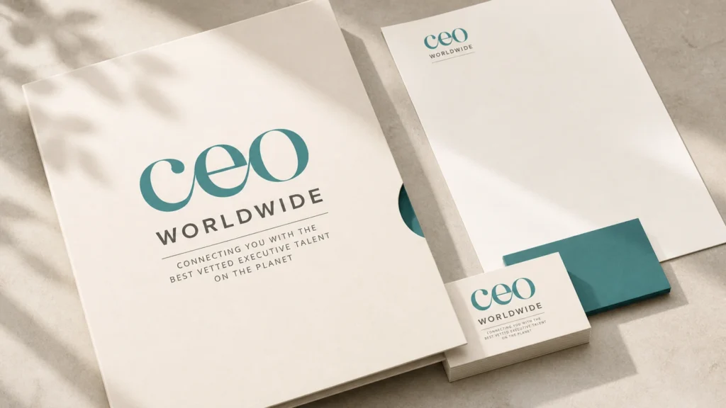
Most professional business cards use both sides. The front typically carries the primary contact information. The back offers design flexibility: a full bleed brand color or pattern, a key value statement, a QR code, a product visual, or a map for location-based businesses. Premium cards often use the back as a brand expression surface — full-bleed color with the logo as the only element — creating a dramatically different experience when the card is turned over.
Aligning Business Card Design With Your Brand System
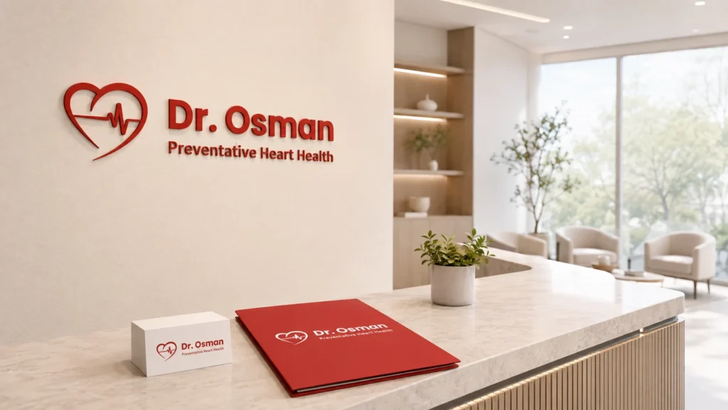
A business card that looks significantly different from the company’s website, email signature, or marketing materials creates confusion and undermines the brand coherence that makes these assets compound. The business card should be obviously, immediately identifiable as part of the same brand system as every other brand touchpoint.
For the complete brand identity system that business card design should extend from, see the marketing and print design service and the brand identity design services guide. For the full visual identity that governs all print design decisions, see the brand design overview.
Make Your First Physical Impression Your Best One
A well-designed business card is often the first physical artifact of your brand that prospects, investors, and partners encounter. Make it count — with the right stock, finish, and design that communicates exactly what your brand stands for before a word is read.