Healthcare Branding: How to Build Trust, Communicate Competence, and Differentiate in a Regulated Industry
Healthcare branding operates under constraints that no other industry faces simultaneously: patients making decisions under stress and vulnerability, regulatory requirements that limit what claims can be made, clinical staff who distrust marketing, institutional buyers who require proof of expertise before engagement, and the existential weight of brands associated with health, safety, and human wellbeing.
Get it right and healthcare branding creates the trust that drives patient acquisition, provider referrals, health system partnerships, and investor confidence. Get it wrong and the consequences extend beyond lost revenue — a healthcare brand that communicates unreliability, inaccessibility, or clinical inadequacy creates real harm to the people it’s supposed to serve.
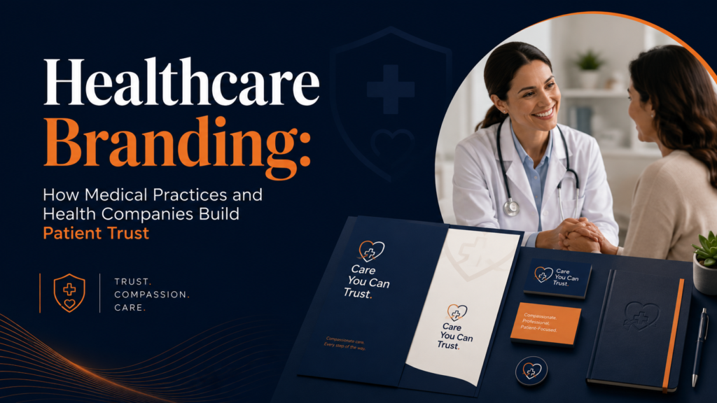
This guide explains what makes healthcare branding distinctive, how to build a brand that earns clinical credibility and patient trust simultaneously, and how to execute the design and communication work that healthcare organizations require.
“In healthcare, trust isn’t built through advertising. It’s built through every interaction a patient has with your system — from the first search result to the last follow-up call. Branding shapes every one of those moments.” — Health Affairs
What Makes Healthcare Branding Different
The Stakes Are Higher
Healthcare decisions involve more than money or preference — they involve bodies, health, and sometimes life itself. The emotional stakes of healthcare purchasing decisions are fundamentally higher than almost any other category. This creates a correspondingly higher standard for trust signals: a healthcare brand that feels untrustworthy doesn’t just lose a customer, it creates genuine fear and anxiety in people already in vulnerable states.
Multiple Audiences with Conflicting Needs
Healthcare organizations typically serve multiple audiences whose needs create genuine tensions at the brand level:
- Patients: Need warmth, accessibility, and reassurance. Clinical authority should feel supportive, not intimidating.
- Clinicians: Need professional credibility, evidence of clinical excellence, and peer respect. Consumer-facing warmth can undermine clinical credibility with this audience.
- Payers/insurers: Need cost efficiency evidence, outcomes data, and operational reliability.
- Health systems and institutional buyers: Need compliance, scalability, and integration capability.
- Investors (for health tech): Need market opportunity clarity, differentiation, and execution evidence.
Regulatory Constraints
Healthcare brand communications are constrained by FDA regulations for medical devices and pharma, FTC guidelines for health claims, HIPAA requirements around patient information, and state-specific regulations for clinical service advertising. Claims about clinical efficacy, comparative outcomes, and specific health benefits require evidence standards that most marketing claims don’t. Healthcare brand communications must be reviewed for regulatory compliance, not just marketing effectiveness.
Trust Deficit Is the Starting Position
Research consistently shows that trust in healthcare institutions has declined across most markets over the past decade. Healthcare brands start with a trust deficit relative to where they need to be, and must actively earn the trust that other industries receive by default. This makes trust-building brand investment more urgent and more valuable in healthcare than in most other categories.
Healthcare Brand Archetypes: Finding Your Character
Different healthcare organizations occupy different brand archetypes based on their positioning, patient population, and care delivery model:
Visual Identity for Healthcare Brands
Color in Healthcare Branding
Color carries strong clinical and cultural associations in healthcare. The most important considerations:
Blue is the dominant healthcare color because it signals trust, reliability, and calm. It’s appropriate for most healthcare applications but has become so saturated in the category that blue alone no longer differentiates. The opportunity is in the specific shade and how it’s applied: a deep, confident navy communicates differently from a bright, accessible light blue, and combining blue with an unexpected secondary color can create differentiation while maintaining the trust signal.
Green signals health, nature, and wellness. It works well for wellness-oriented brands, mental health organizations, and preventive health companies. It can feel clinical or consumer depending on execution — deep forest green reads as more sophisticated and clinical; bright, saturated green reads as more consumer and accessible.
White and neutrals signal cleanliness, precision, and clinical clarity. Premium healthcare brands often use white generously, with color as accent. This approach communicates sophistication and professionalism but can feel cold without warm photography or humanizing type choices to balance it.
Warm tones (warm grays, cream, gentle warm accents) have become increasingly used in mental health, wellness, and patient-centered care brands as a deliberate departure from the cold clinical associations of traditional healthcare palettes.
Typography for Healthcare
Healthcare typography must balance two imperatives that sometimes conflict: legibility (clinical and patient communication must be readable by people with varying literacy levels, vision differences, and cognitive states) and brand personality (typography is a primary carrier of the brand’s character and differentiation).
Accessibility requirements for healthcare communications go beyond standard web accessibility guidelines. Patient-facing materials should be readable at minimum 12pt for print, 16px for digital, with sufficient color contrast (WCAG AA minimum, AAA preferred for patient-facing content) and clear typographic hierarchy that doesn’t require design literacy to navigate.
Photography and Imagery
Healthcare photography is where most healthcare brands make their biggest mistakes: defaulting to generic stock photography that undermines everything the visual identity has built. Stock photos of doctors in white coats smiling at patients, families running in fields, and generic hospital corridors all read as inauthentic and are visually interchangeable across thousands of healthcare organizations.
Healthcare brands that differentiate visually use custom photography: real patients (with appropriate consent), actual clinical staff, real facilities, and authentic moments. The art direction should be specific to the brand’s character: warmth for patient-centered care brands, precision for specialty clinical brands, community for population health organizations.
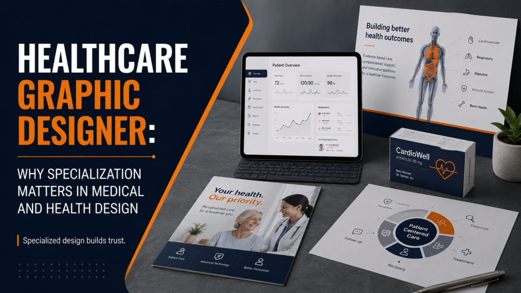
For detailed guidance on healthcare-specific design considerations, see how to choose a graphic designer for healthcare and the most common healthcare branding mistakes. The healthcare graphic designer service is built specifically for organizations navigating these considerations.
Healthcare Digital Branding: Website, Patient Portal, and App
Healthcare Website Design
Healthcare websites serve a more complex set of user goals than most category websites. Patients arrive with immediate needs (find a doctor, schedule an appointment, access records), research needs (understand a diagnosis, compare treatment options, assess credentials), and navigation needs (find the right department, understand insurance coverage, get directions). The website architecture must serve all of these journeys simultaneously.
Healthcare website design priorities:
- Find-a-doctor and appointment scheduling must be immediately accessible — these are the most common primary user goals
- Clear navigation hierarchy for departments, conditions, and services
- Mobile-first design (patients research and schedule on phones)
- Accessibility compliance (WCAG AA minimum)
- Load speed (patients in acute situations do not have patience for slow websites)
- Trust signals prominent: credentials, accreditations, patient outcomes data, reviews
Patient Portal and App Design
The patient portal and mobile app are where healthcare brand promise meets healthcare experience most directly. Every patient who logs in to view results, request refills, or communicate with their care team is experiencing the brand. Poor digital experience design in healthcare creates anxiety (results that are hard to interpret), frustration (scheduling flows that are confusing), and eroded trust — exactly the opposite of what healthcare brands need to build.
Healthcare Brand and Compliance: Working Together
Healthcare brand communications that work within regulatory constraints, rather than around them, produce more durable and trustworthy brands. This means:
- Claims based on what can be substantiated. “Expert care” and “leading-edge treatment” are vague enough to be defensible. “Best outcomes in the region” requires data. Make sure every claim is supportable.
- Patient stories with appropriate consent. Testimonials are powerful but require robust consent processes. Work with your legal and compliance team to establish a patient story program that meets HIPAA requirements.
- Clinical staff review of clinical claims. Marketing content that includes clinical information should be reviewed by a clinician. This protects the brand and the patients it communicates with.
- Accessibility as a baseline. Healthcare communications that are not accessible to people with disabilities are both a legal risk and a brand risk in a category defined by care for human wellbeing.
For the full design service that supports healthcare branding projects, see the branding and identity design service and the website design service.
Build a Healthcare Brand That Earns Trust at Every Touchpoint
In healthcare, your brand is the promise you make to patients, clinicians, and partners before they ever experience your service. Built with the right combination of clinical credibility and human warmth, it creates the trust that drives everything else. Let’s build yours.