Patient trust is not built only through clinical outcomes and bedside manner. Long before a patient meets a doctor, they judge a healthcare brand by how it looks. Your logo, website, waiting room leaflet, and social media presence all make a first impression — and first impressions in healthcare are harder to reverse than in almost any other industry.
These are the five branding mistakes I see most often when working with healthcare companies, and what to do instead.
Mistake 1: Using Stock Medical Imagery
The stethoscope. The smiling doctor with a clipboard. The abstract DNA helix. The globe with a red cross. These images are so overused that they have become invisible to your potential patients, and for the rest they signal one thing: generic.
The problem is not that these images are bad. It is that every competitor uses them. When every healthcare brand in your city uses the same three images, none of you stand out — and patients cannot distinguish your clinic from the one down the road.
What to do instead: Invest in original brand photography specific to your facility and team. Real photos of real people build more trust than any stock image. If a photoshoot is not in budget yet, use clean, minimal design with custom illustrations or abstract graphics that are specific to your brand identity.
Mistake 2: Using a Generic Logo That Cannot Scale
A logo that looks acceptable at A4 size but becomes an unreadable smear at social media profile photo size is a genuine operational problem. Healthcare brands appear in many contexts where logo quality matters:
- Website favicon (16×16 pixels)
- Social media profile photo (400×400 pixels)
- Appointment reminder SMS with a small logo
- Building signage at large sizes
- Embossed on clinic stationery
What to do instead: Your logo needs to be designed as a system. A primary version, a compact version, and a standalone icon that works at small sizes. All should be delivered as vector files (SVG, AI) so they scale without quality loss.
Mistake 3: Inconsistent Visual Identity Across Touchpoints
One of the strongest signals of a trustworthy healthcare organisation is consistency. When your website uses one font, your brochure uses another, your social media posts use a third, and your reception signage uses whatever the sign shop defaulted to — patients subconsciously register that this organisation does not have its act together.
Consistency signals control, and in healthcare, patients need to believe you are in control.
What to do instead: Create brand guidelines. A simple document that defines your logo usage, approved colours (with hex codes), and approved fonts is enough to ensure that anyone producing materials for your brand does it consistently. This is not optional — it is a management tool.
Mistake 4: Choosing the Wrong Colour Psychology
Colour in healthcare branding is not purely aesthetic. Colour communicates clinical field, patient demographic, and brand personality before a patient reads a single word.
- Blue: Trust, technology, clinical precision (overused in health insurance and general practice)
- Green: Wellness, recovery, environmental health
- Purple: Oncology, mental health, premium care
- Orange: Energy, accessible, preventive health and fitness
- Navy and gold: Premium, specialist, private practice
The mistake is choosing a colour because “it looks nice” without thinking about whether it signals the right clinical territory to your specific patient demographic.
What to do instead: Choose colours strategically based on your clinical specialty, your target patient, and your competitive positioning. A healthcare branding specialist will guide you through this decision — it is worth the investment.
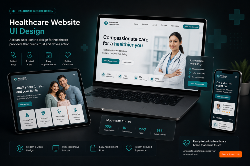
Mistake 5: Treating the Website as an Afterthought
In most healthcare markets, the patient journey begins with a Google search. Your website is the first thing a prospective patient sees before they call your front desk or walk through your door. A website that loads slowly, looks like it was built in 2012, or does not work on mobile communicates exactly that level of care.
What to do instead: Treat your healthcare website as a trust-building tool, not an online brochure. It should load in under 3 seconds on mobile, have a clear first action for new patients (book an appointment, call, or fill a form), present your clinical credentials clearly, and use the same visual identity as all your other materials.
The Common Thread
All five mistakes have the same root cause: treating design as an afterthought rather than as a core part of how patients experience your brand. Healthcare brands that invest in professional design consistently report that it improves their ability to attract new patients, retain existing ones, and command appropriate fees for their services.
If you are ready to address these issues in your healthcare brand, read about the healthcare design service or get in touch.