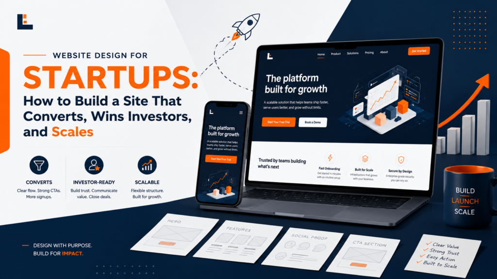
Website Design for Startups: How to Build a Site That Converts Visitors, Wins Investors, and Scales With Your Growth
A startup’s website is its most important marketing asset. It’s the first place investors go after a warm intro. It’s where enterprise buyers verify credibility before agreeing to a discovery call. It’s where customers assess whether your brand signals match their expectations before they trust you with their business. And unlike a pitch deck, a brochure, or a business card, the website is always on—representing your company at 2 AM on a Saturday when no founder or salesperson is available to answer questions.
This guide is about building a website that works. Not just a website that looks good, but one that converts visitors into customers, supports the sales process, scales as your company grows, and represents your brand with the consistency and quality that early-stage investors and enterprise buyers expect.
“Your website is not a brochure. It’s your best salesperson—always on, always on-brand, always making the first impression you’d want to make if you could be in every room simultaneously.” — David Ogilvy (adapted)
The Four Jobs a Startup Website Must Do
Job 1: Establish Credibility in the First 10 Seconds
Research on website user behavior consistently shows that visitors form first impressions within 50–500 milliseconds and decide whether to stay or leave within 10 seconds. Your website has approximately 10 seconds to communicate: we are a real, credible company doing something worth your attention. If the design looks amateur, the copy is vague, or the page is slow to load, most visitors leave before they see your product or your value proposition.
Job 2: Communicate the Value Proposition Clearly
The most common website failure for startups is a hero section that sounds interesting but communicates nothing specific. “The platform that transforms how teams work” tells a visitor nothing about what the product does, who it’s for, or why they should care. The best startup website copy is specific: “Project management for law firms that tracks billable hours automatically” immediately tells visitors exactly what the product is, who it’s for, and what benefit it delivers.
Job 3: Guide Visitors Toward a Specific Action
Every visitor to your website is at a different stage of awareness and consideration. A first-time visitor needs different content than someone who’s been evaluating your product for three weeks. A well-designed website website serves visitors at every stage of the buying journey—educational content for early-stage visitors, comparison content for evaluation-stage visitors, and clear CTAs for purchase-ready visitors.
Job 4: Support the Sales Process
For B2B startups especially, the website isn’t just for converting website visitors—it’s a tool sales teams use to support their pipeline. Prospects research your website before demos, between demos, and after demos. Case studies, technical documentation, pricing pages, and leadership bios all serve the sales conversation even when the sales team isn’t physically present.
Pages Every Startup Website Needs
Design Principles That Separate High-Converting Startup Sites
Hierarchy: The Most Important Thing Gets the Most Space
Information hierarchy is the most foundational concept in web design: the visual weight, position, size, and contrast of every element should reflect its relative importance. Your value proposition should be larger, bolder, and more visually prominent than anything else on the homepage. Your primary CTA should be more visible than secondary navigation. Hierarchy that’s clearly established produces pages visitors navigate intuitively; hierarchy that’s absent produces pages that feel overwhelming and confusing.
Whitespace: What You Leave Out Matters as Much as What You Include
Amateur web design fills every pixel. Professional web design uses whitespace as an intentional design element: to create emphasis, to create breathing room, and to signal that the brand is confident rather than anxious. Crowded pages feel cheap. Pages with generous whitespace feel premium. This correlation exists because luxury brands consistently use generous whitespace while budget brands fill every pixel with value propositions and promotional copy.
Speed: The Page That Loads Is the Page That Converts
Core Web Vitals—Google’s framework for measuring page experience—establish that Largest Contentful Paint (the time until the main content loads) should be under 2.5 seconds, and that Cumulative Layout Shift (visual instability while loading) should be under 0.1. Pages that fail these benchmarks have documented lower conversion rates and rank lower in search results. Speed optimization is not optional; it’s a fundamental requirement of professional web design.
Mobile Responsiveness: Your Site Is Primarily a Mobile Site
More than 60% of global web traffic is now mobile. For B2C startups, that percentage is often higher. Google indexes the mobile version of your site first. A website designed primarily for desktop is fundamentally failing its majority audience before they see a single word of your content. Every design decision—layout, font sizes, button dimensions, image ratios—must be validated at mobile screen sizes.
Brand Consistency: Every Page Must Feel Like the Same Company
Visual inconsistency across pages—different header treatments, different color applications, different typography hierarchy—signals organizational disorder and undermines the credibility that every page is trying to build. A brand standards document applied to all pages consistently is one of the most effective quality improvements a startup website can make. For the brand identity foundation that drives website consistency, see the brand identity design services guide.
Technical Platforms for Startup Websites
For startups with a HubSpot CRM investment, building the website on HubSpot CMS creates native integration with forms, contact records, email marketing, and analytics—eliminating the data integration complexity of running website and CRM on separate platforms. For expert design-to-HubSpot website work, see the HubSpot website design service and the Figma to HubSpot design service.
Startup Website Design Process
Phase 1: Discovery and Information Architecture (Week 1)
Before any visual design begins, the information architecture must be clear: what pages are needed, what’s on each page, and how they connect. This is defined by the customer journey: what does a visitor need to see, in what order, to arrive at a purchase or inquiry decision? A sitemap and page-level content brief for each page is the deliverable.
Phase 2: Wireframes (Week 1–2)
Wireframes are low-fidelity layouts that establish the structure of each page without any visual design: what content blocks appear, in what order, at what rough proportion. Wireframe review is faster and cheaper than revising fully designed pages—this is where to make structural decisions before design investment commits to them.
Phase 3: Visual Design (Week 2–4)
The wireframes are designed: colors, typography, imagery, and all visual elements applied. High-fidelity mockups produced for all primary pages at desktop and mobile. Design review at this stage should focus on brand consistency, hierarchy clarity, and conversion flow—not aesthetic preference for its own sake.
Phase 4: Development (Week 4–7)
The design is built on the chosen platform. Development quality matters significantly: the same visual design built with clean, performant code produces a dramatically different website experience from one built with bloated templates and unnecessary plugins. Specify performance benchmarks (Core Web Vitals targets) as part of the development brief.
Phase 5: QA and Launch (Week 7–8)
Testing across browsers, devices, and screen sizes. Form submission testing. Load speed testing. Content review. Launch checklist execution: redirects from old URLs, analytics tracking, sitemap submission, and SSL verification.
Ongoing Website Strategy: The Work That Never Ends
A website launch is not the end of the project—it’s the beginning. The highest-performing startup websites are treated as living products that are continuously optimized based on data:
- Analytics review: Where are visitors entering, exiting, and converting? Which pages have high bounce rates that warrant investigation?
- Conversion rate optimization: A/B testing of headlines, CTAs, and page layouts to improve conversion performance
- Content publishing: Regular blog posts that build organic search traffic over time
- Design refreshes: Updating the design every 18–24 months to maintain modern appearance as design conventions evolve
For a deeper look at the automation and integration possibilities that make a startup website more intelligent over time, see the AI workflow automation service. To discuss your startup website project—new build, redesign, or platform migration—reach out for a conversation about your specific situation.
Your Startup Deserves a Website That Works as Hard as You Do
A startup website is your best salesperson, your most important investor impression, and your primary brand expression—all in one. Built on the right platform, with the right design system and the right conversion strategy, it becomes a growth asset that pays dividends for years. Let’s build yours.