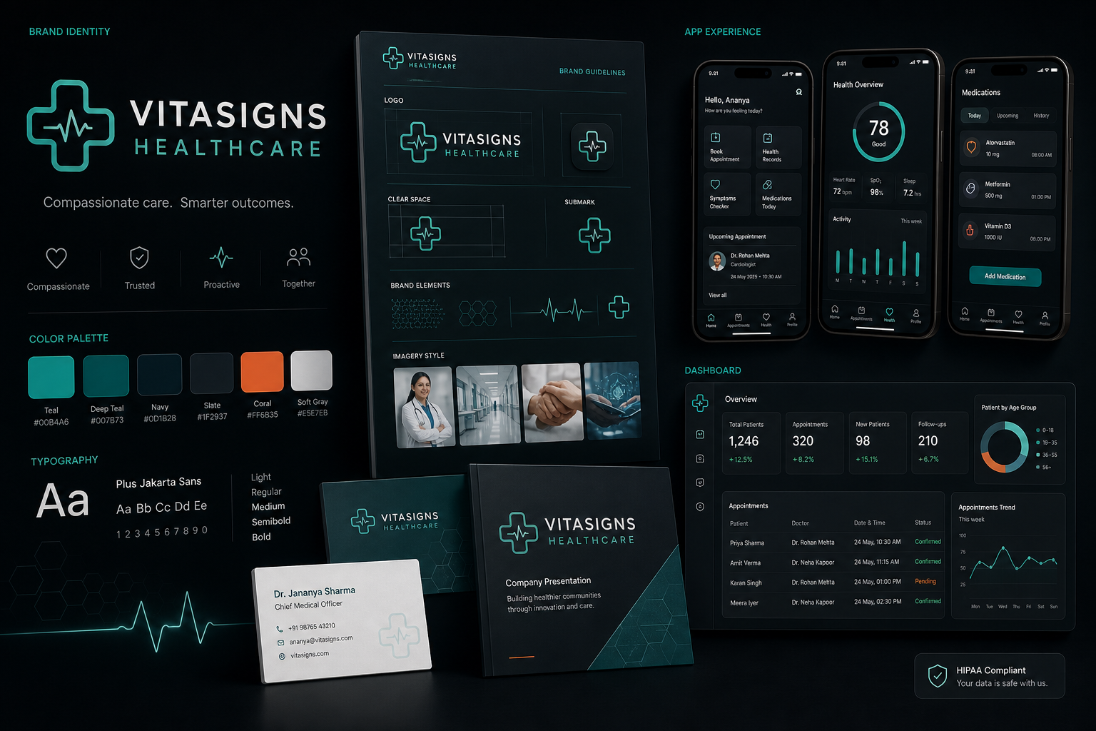
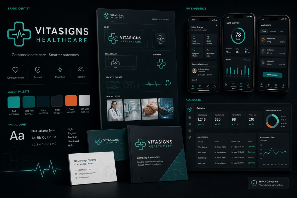
Branding
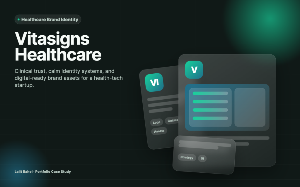
Vitasigns Healthcare Brand Identity
A healthcare brand identity system built to communicate trust, clinical clarity, and digital readiness.
A healthcare brand identity system built to communicate trust, clinical clarity, and digital readiness.
The brand needed to look clinically credible without feeling cold or generic. The identity also had to work across app screens, presentations, stationery, and partner communications.
Create a calm, trusted brand identity system that could support patient-facing and B2B healthcare communication.
Brand strategist and visual identity designer
I used a restrained healthcare palette, soft geometric forms, and clear hierarchy so the brand could feel modern, safe, and easy to understand.
The final system gave the startup a more credible identity for investor conversations, product screens, and healthcare partner outreach.
The brand finally feels like a real healthcare product, clean, professional, and ready to present.
The healthcare brand had a credible product direction but needed a calmer, more professional visual system that could work across patient-facing and partner-facing materials.
The project created a healthcare identity system with a cleaner visual language, reusable brand assets, and a more consistent foundation for screens, presentations, stationery, and outreach.
Vitasigns needed a brand system that felt trustworthy to patients and credible to healthcare partners. The project focused on a calm identity direction, practical visual rules, digital-ready assets, and a presentation style that could support both product and clinic communications.